Sabre Global Rebranding for IPO
Reimagining Legacy Brand for Future Shareholders
This transformation repositioned Sabre as a modern, technology-driven leader in the travel industry, aligning brand identity, messaging, + design systems to strengthen market perception + investor confidence. The rebrand unified disparate business units, streamlined communication across global markets, + established a cohesive visual identity reflective of the innovation + leadership present at Sabre, at that time.
My Role
As Principal Designer, I led the strategic + visual transformation of Sabre digital assets + tools in preparation for its IPO ($627M raised). My contributions included:
Brand Strategy + Execution: Unified 20+ regional micro-sites, global product pages, and digital assets under a scalable design system.
Cross-Functional Leadership: Collaborated with marketing, engineering, + leadership to ensure consistency across all touchpoints.
UI/UX + Design Systems: Integrated Sabre Spark EDL, a standardized UI component system for scalable design + development of web-based tools.
Impact + Scalability: Enabled a seamless rebrand rollout, improving engagement, cohesion, + future-proofing design workflows.
This initiative positioned Sabre as a modern, globally unified brand, reinforcing its leadership in travel technology.
Problem
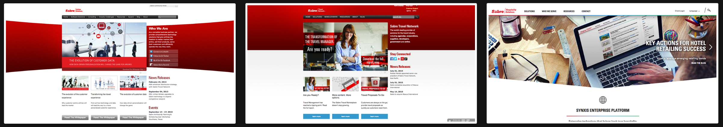
Sabre operated as four distinct business units, each with separate branding, messaging, + digital assets, which led to:
Fragmented Market Presence: No unified identity to communicate the full scope + impact of Sabre messaging to investors + customers.
Inconsistent Design + Messaging: Differing visual styles + narratives diluted brand recognition across regions + platforms.
Operational Inefficiencies: Decentralized branding efforts resulted in redundant asset creation, slower marketing execution, + disjointed internal communication.
As Sabre prepared for its IPO, aligning brand identity, digital assets, + investor messaging became a strategic priority to build trust + drive valuation.
Solution
The Sabre Global Rebrand addressed these challenges by delivering:
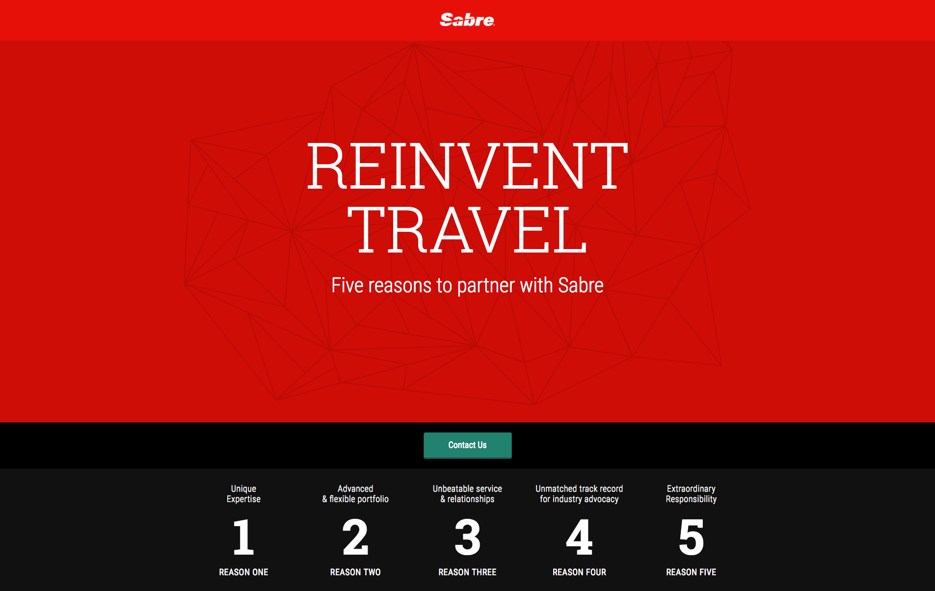
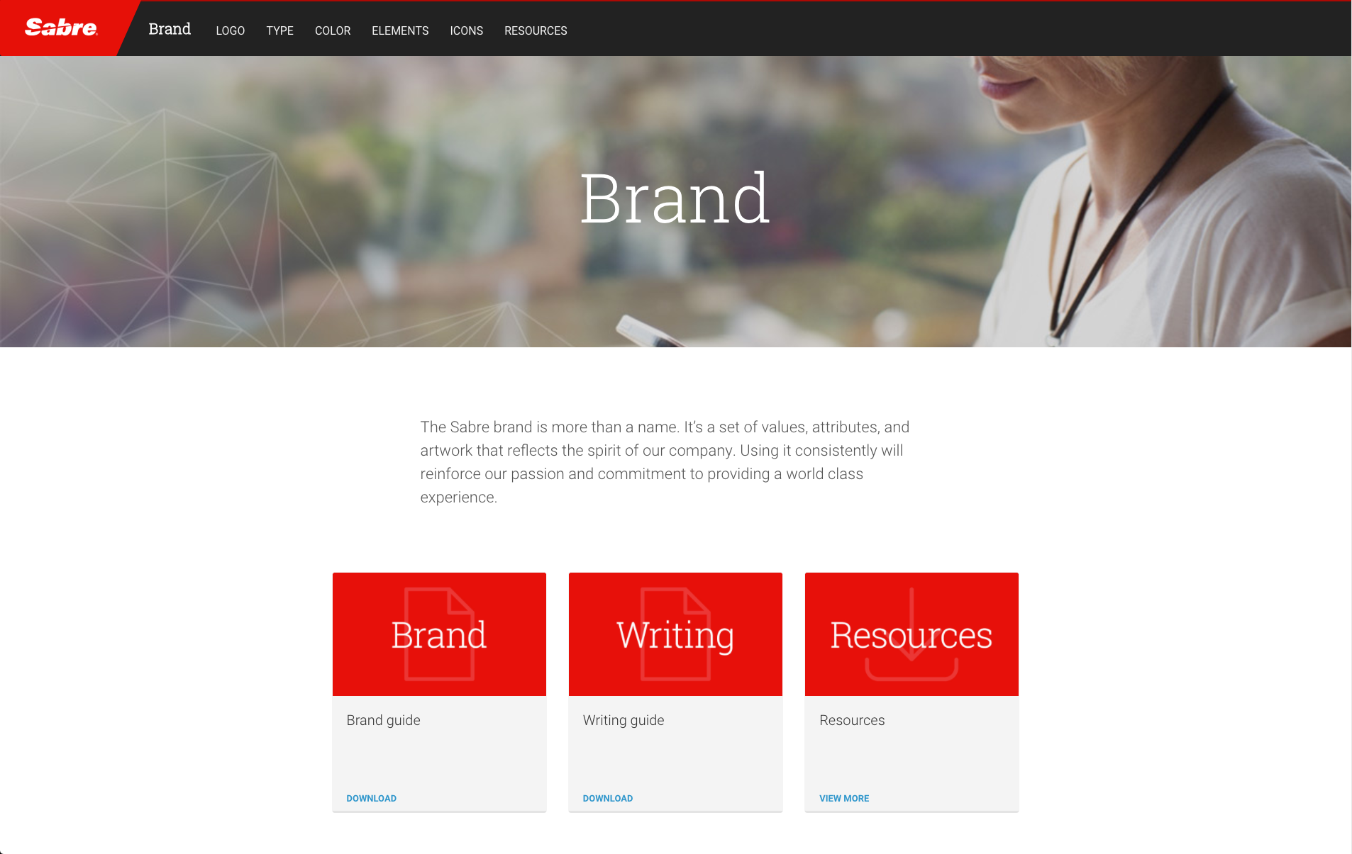
Unified Brand Identity: Consolidated four separate business unit logos into a single, cohesive identity symbolizing innovation, stability, + leadership. Established a singular narrative that reinforced Sabre’s technological leadership + global reach.
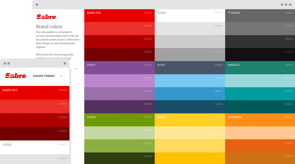
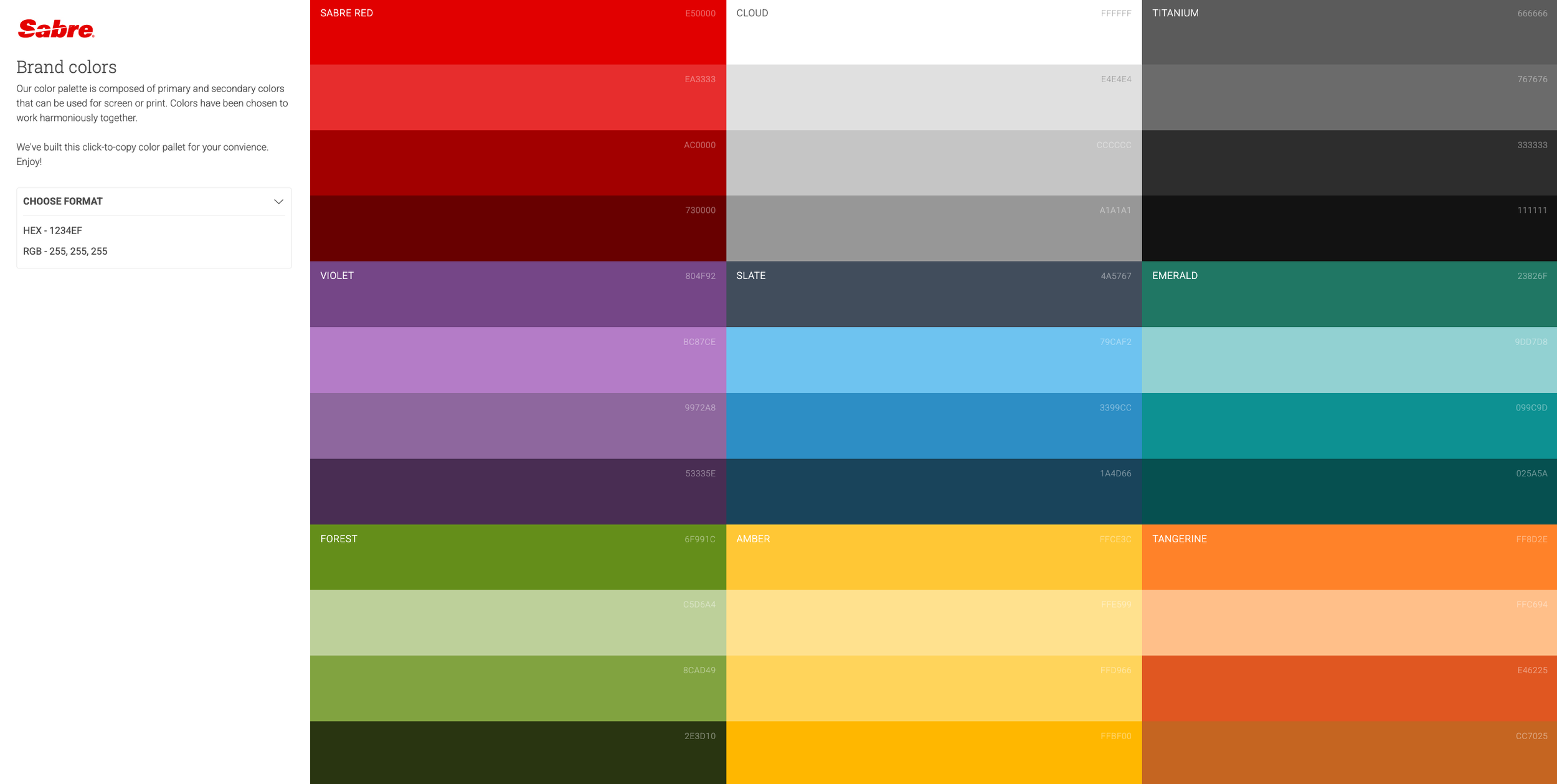
Scalable Brand Standards + Design System: Developed a comprehensive brand guidelines framework, covering: Typography, color palettes, iconography, + imagery. Visual hierarchy + storytelling principles.
Created modular, reusable design components, ensuring brand consistency + faster asset production across marketing, sales, + investor communications.
Investor-Focused Assets + Messaging Strategy: Produced high-impact pitch decks, investor presentations, + financial reports that effectively conveyed Sabre’s business value + growth potential.
Developed visual storytelling frameworks to highlight market position, innovation, + long-term vision.
Design Execution
+ Prototyping
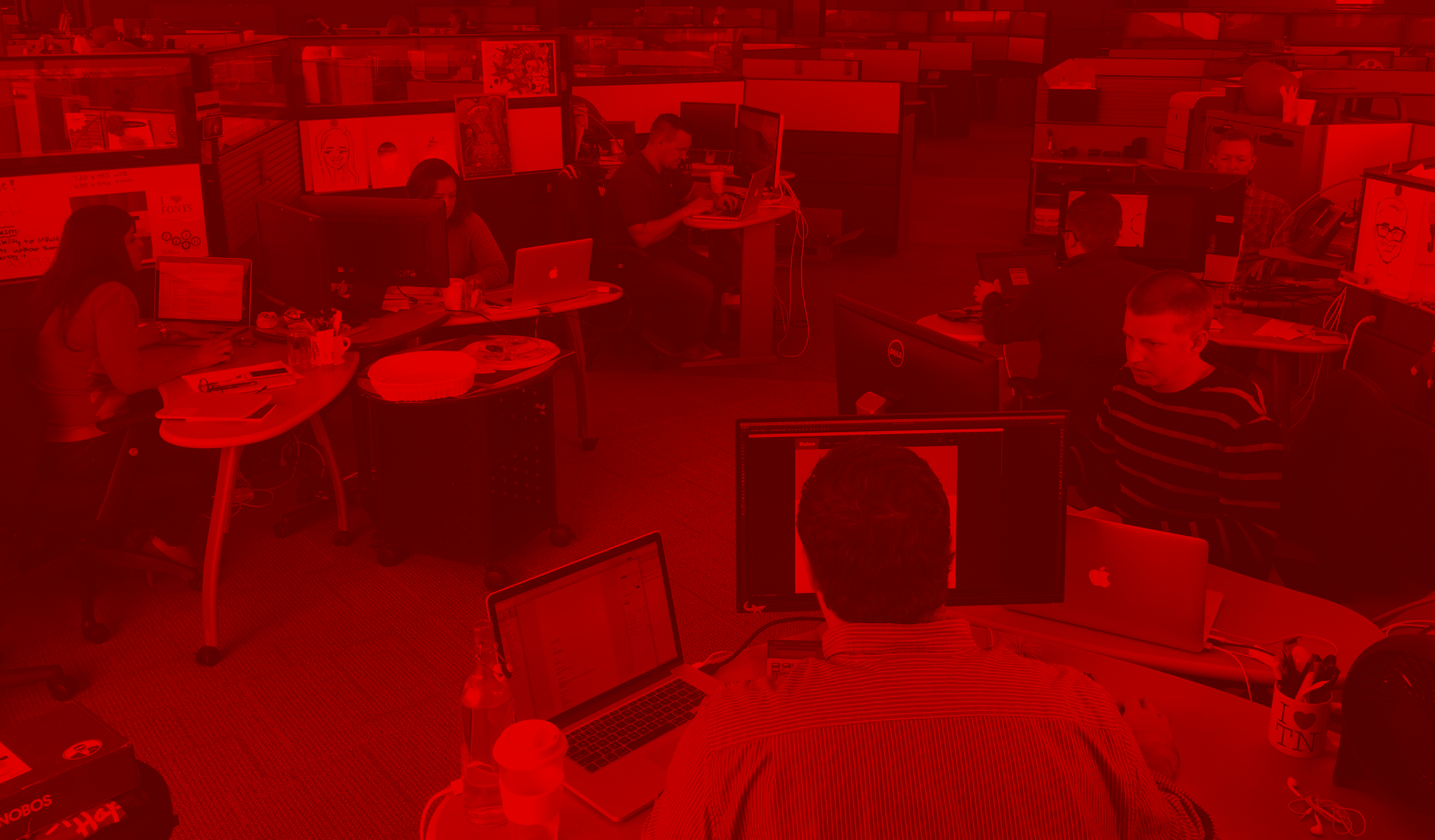
Created high-fidelity brand mockups, digital style guides, + templates for marketing campaigns, website assets, + corporate communications.
Iterated designs through stakeholder feedback loops to ensure alignment with executive leadership + investor relations teams.
Implementation
To establish a cohesive + differentiated brand presence for Sabre, the team conducted in-depth research + strategy development.
This included comprehensive brand audits, stakeholder interviews, + competitive analysis to clarify the market position + refine the core value proposition.
By synthesizing insights across business units, we defined key messaging pillars that unified the brand under a single compelling narrative aligning internal teams while strengthening external perception.
Shipped
Features
Unified Logo + Identity: A single, modernized brand mark replacing the fragmented business unit logos.
Enterprise Design System: A scalable design framework for web, digital assets, + marketing collateral.
Investor Communication Materials: Professionally designed pitch decks, financial reports, + corporate presentations tailored for IPO success.
Global Marketing Templates: Modular campaign assets, social media branding, + sales enablement tools for rapid deployment.
Cross-Team Collab
+ Rollout
Partnered with marketing, engineering, + regional leadership to ensure seamless implementation across all digital + physical brand touchpoints.
Conducted global training sessions for internal teams to maintain consistency in brand execution.

Results
IPO Success: Sabre raised $627 million, with shares priced at $16 each, valuing the company at $3.93 billion. On its first trading day, the stock closed at $16.39, demonstrating strong investor confidence.
Increased Brand Recognition: The rebrand positioned Sabre as an innovative, forward-thinking technology company, resonating with investors + customers alike.
Operational Efficiency Gains: The new design system reduced asset creation time by 30 percent, enabling faster campaign rollouts + improved internal workflows.
Stronger Market Presence: A cohesive, professional brand identity reinforced market leadership, improving customer trust + business development opportunities.
Challenges + Learnings
Stakeholder Alignment: Unifying four distinct business units required careful navigation of internal expectations, executive buy-in, + cross-team collaboration.
Global Implementation: Managing regional rollout complexities underscored the need for scalable brand governance models.
Balancing Legacy + Innovation: Successfully modernized brand perception while retaining the legacy credibility + strengths of each business unit.
Outcome
This effort was a pivotal initiative that not only contributed to a successful IPO but also solidified the company as a leader in travel technology.
By transforming disjointed business units into a unified global brand, investor confidence, operational efficiency, + market positioning saw significant improvement.
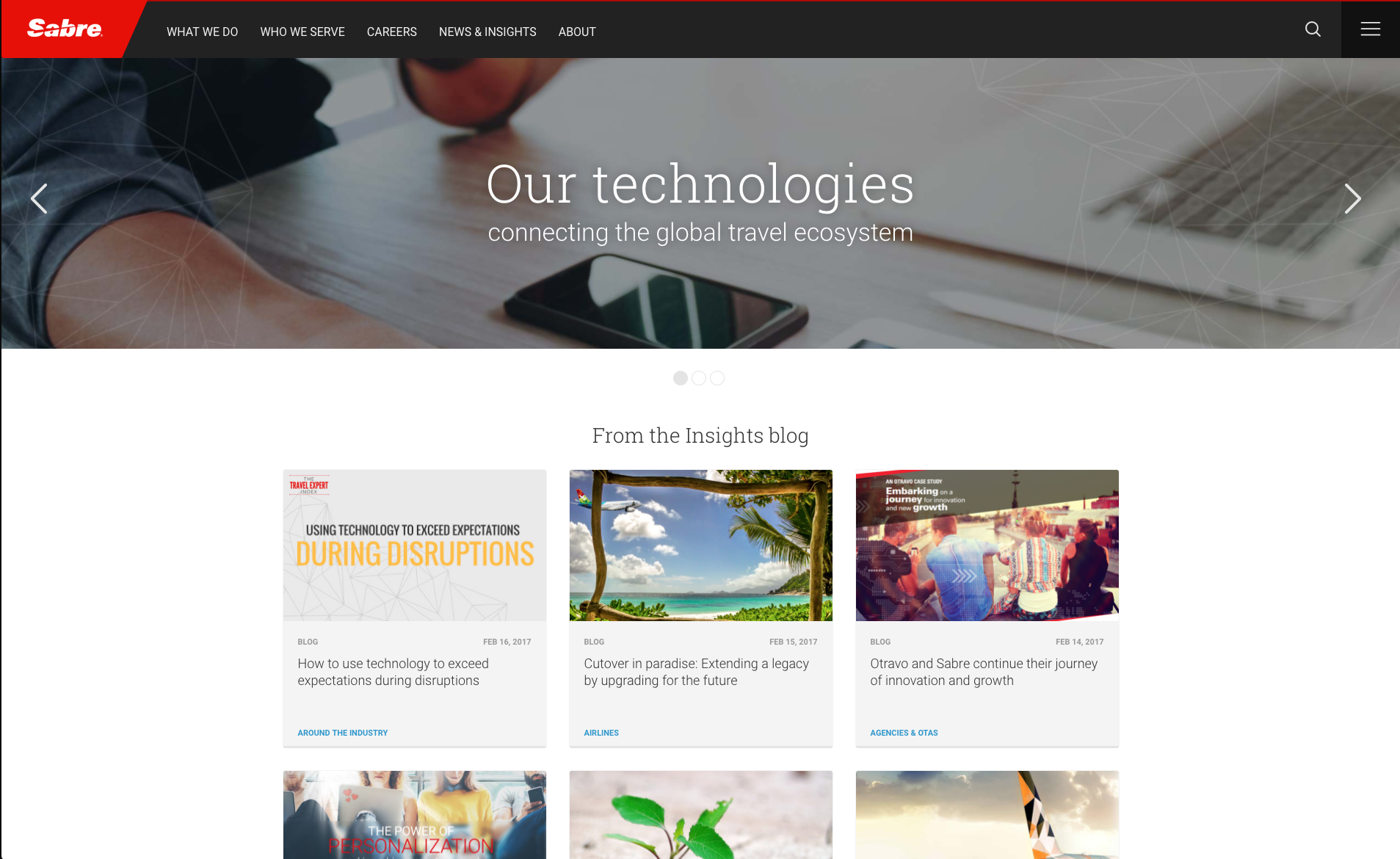
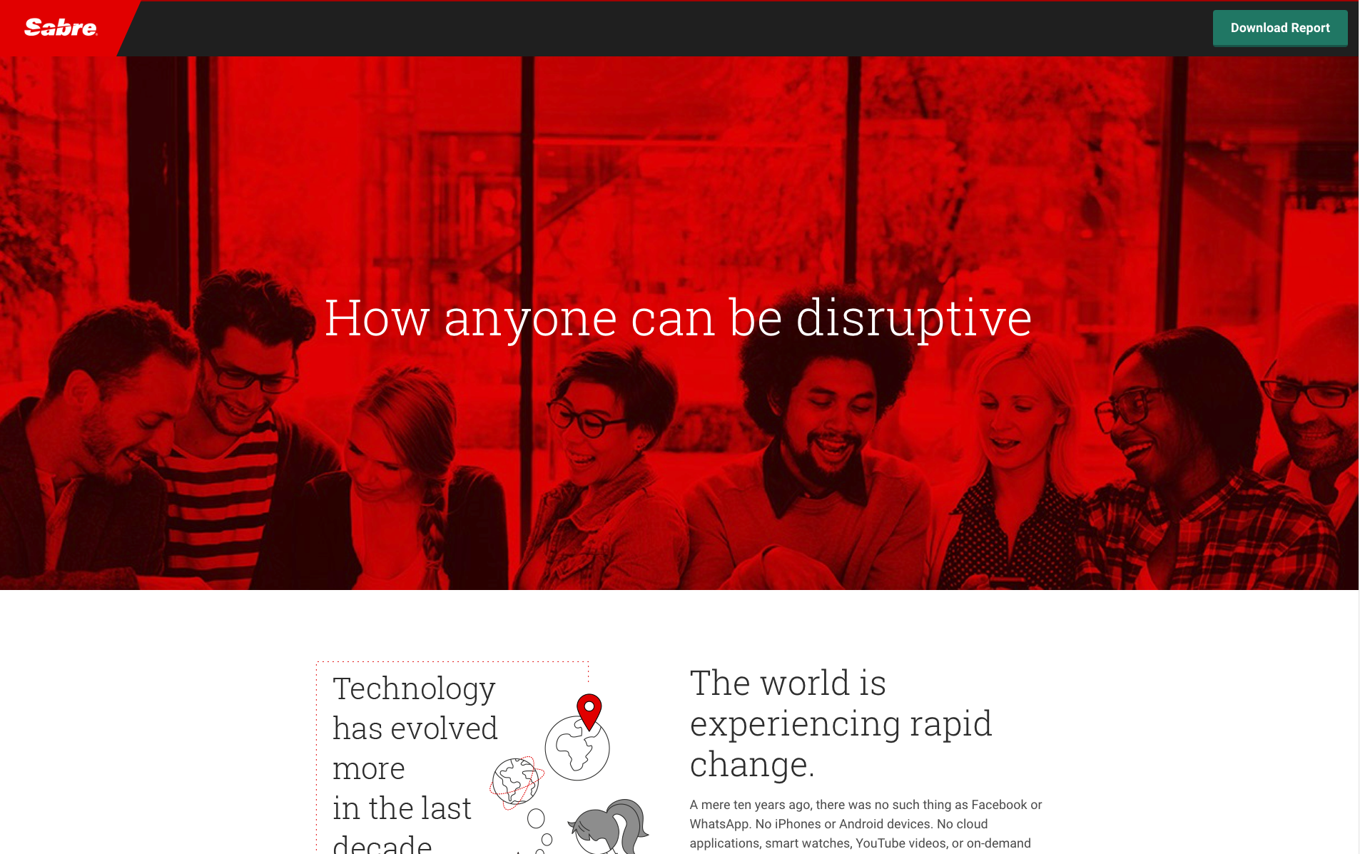
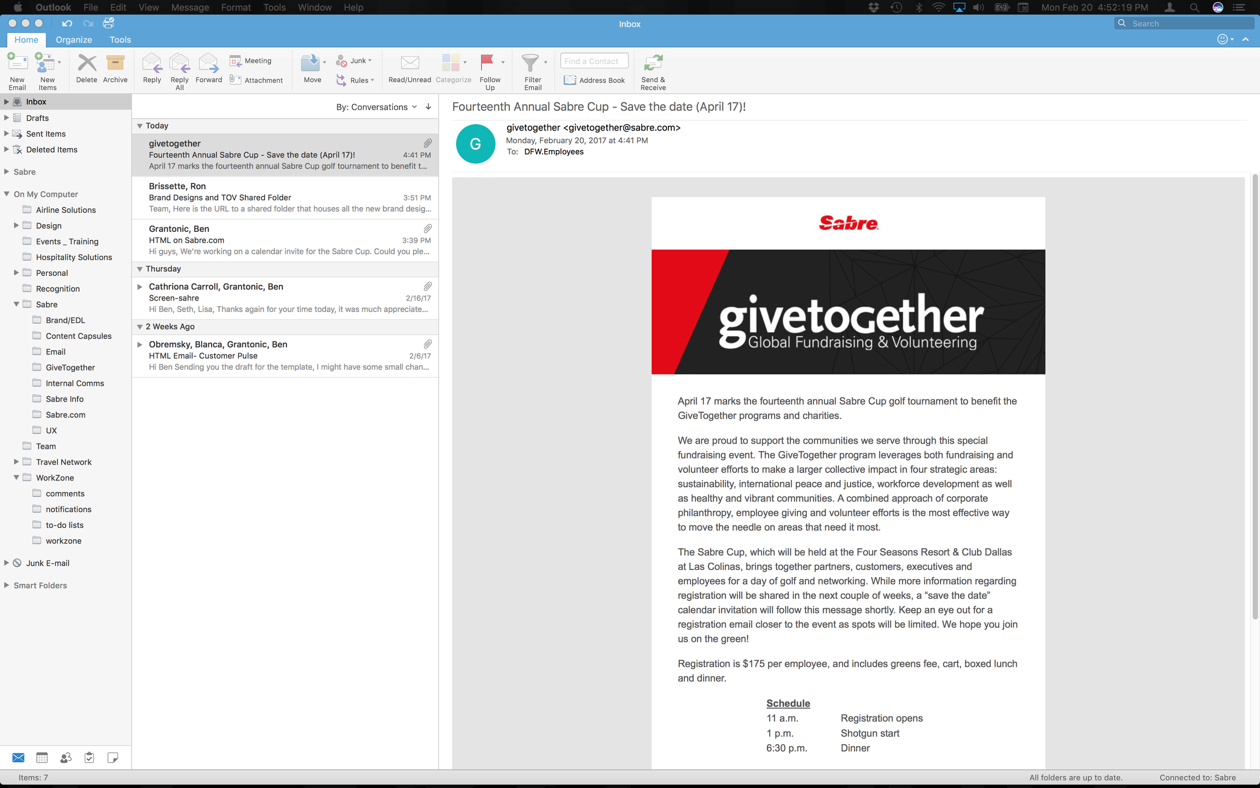
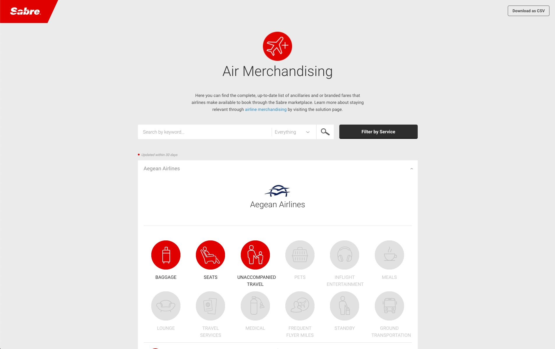
As our team worked to redefine Sabre brand identity, we identified a significant challenge, inconsistent digital experiences across 20+ regional platforms. This insight drove the need for a cohesive, scalable digital framework, ensuring that the newly established brand identity was not just visually consistent but also functionally integrated across all customer engagement points. The result was a multi-brand, enterprise-grade design system + digital platform, streamlining operations and reinforcing Sabre new positioning in the public market.
Insight from this overall effort continues to inform my approach to strategic design leadership, global brand unification, + high-stakes corporate transformations.